
Having recently completed a major web makeover project, I thought it would be good to share some of what took place and feature this recent work to share some detail on the process and tools that we use. But first here’s a look at the home page of the new Majac Medical website that we delivered:

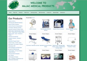
The site (launched a few weeks ago now) is the online presence for Majac Medical. A product distribution business that has carved out a sweet spot in the medical industry, supplying professionals in hospital, dental, primary care and veterinary industries with the products that they use every day. The problem was the previous website was pretty long in the tooth and wasn’t serving the business well. It had been put together by a major player in the printing industry (in Australia), but the site no longer reflected the quality of the business and the plan is to grow the business in a big way. Below right is what the old website looked like.
For a couple years I have been focusing on User Experience Design after 15+ years as a programmer in the software/web industry. My observation has been that users in many software projects were being considered primarily as an after thought, which sucks when the costs of some major projects run into the millions of dollars and ultimately if the users don’t like and use it the project is a failure. Having spent a few days in workshops in Toronto, late last year looking at the Psychology of Behavior Change and connecting with a talented graphic designer named Eli I got excited about this opportunity to apply some of what we learned and collaborate on the project.
After initial discussions with my client contact, a colleague named James who has a background in marketing as well, we brought Eli on board to conceptualise a new logo that would serve as the anchor for the online presence and she did a rockstar job of zeroing on the right symbol for the company. We used InvisionApp to collaborate and work through ideas and concepts. There was some great ideas coming together and the client eventually settled on a brand mark that is modern and conveys their scientific.
Early on James and I spent time discussing how customers had been ordering products and identified that the custom relationship was important to the business but ordering would often be done quite informally and placed on account. So we planned out a staged approach to the website delivery, starting by initially providing a web based quick ordering process and perhaps later moving to a cart system where people could place orders online. This gave me some direction in terms of the software infrastructure that I choose to use (WooCommerce) as I wanted something we could easily turn into a full fledged shop when the client was ready.
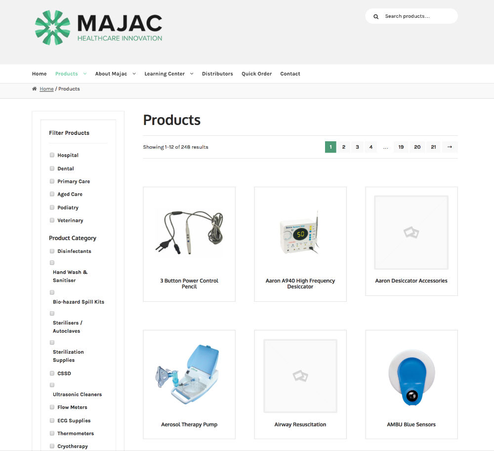
 I started wire-framing the site pages on paper by hand (which I’ve learned in UX design is often the quickest way to get started) and later took these wireframes into Sketch where I could modify them more easily based on input from James and Eli (see the sketch version of the wireframe below right). To the left is an example of the products page wireframe that led to the Sketch version. This is pretty close to what we ended up with as you can see on the final Products page (see screenshot below left).
The value of doing sketches and wireframes, really shows through the more detail you go into in developing the site, and the more people you have working on the project. In this case with three primary people working on it, it was definitely still a useful exercise as it made clear what we were aiming for and ensured that even though the three of us were often in different countries or locations, we were all on the same page about what needed to be delivered.
 When it came to doing stationary elements to go with the new branding later in the project, I found it useful to get input from James (the client) in this way as well. I made a trip to Brisbane in the middle of the project and in a meeting got him to sketch how he imagined the stationary should look. This rough hand drawn sketch was a useful input for Eli, who I met with in Toronto a week later, as she was able to adapt here ideas from working on other branding projects, to meet the client’s expectations about how this would work for them.
As always, setting expectations and then fulfilling on them is critical to the success of a project. One of the things I spent a fair bit of time doing early on, was making sure that there were plugins (bits of software) that I could use in the site development to meet the requirements that we were drawing up by hand (initially) and discussing in the UX Research/UX Design part of the project.
 One of the biggest challenges of the project was to do with the content (so often this is the most overlooked part of a website development project). In this case the products on the site had been grouped together on many pages with multiple products of a particular type appearing on the one page. This may have made sense when the site was built, but now that we had decided to head down the eCommerce pathway and use WooCommerce it was time to start handling products atomically (i.e. displaying each product on it’s own). I knew this would improve things from a Search Engine Optimisation perspective and make more sense in the long run in terms of maintaining the site. But the immediate issue was that I was going to have to deal with the data migration myself, manually. A non-trivial task when you have hundreds of products and many of them have product data sheets or brochures, and multiple images. Categorising the products in a sensible way and tagging them appropriately added to this task and there was a bit of re-work at times as we found that the existing metadata just didn’t make sense. Sometimes when there’s a big job to do, you realise that there are no shortcuts and the only way to do it is to dig in and get it done. Fortunately I had some “holiday” time lined up that saw me sitting around on the North Shore of Hawaii with plenty of time (between waves) to sit with the computer and get this done. So it wasn’t all bad.
The product images on the old site needed serious improvement, so as part of the manual product import, I individually sourced better images for many of the products and spent time, splitting the product pages into atomic products (where they had previously been grouped by product type). Having them separated into their own product pages, I knew would be crucial for SEO and would lead to a stronger result for the business longer term. Eli had done a fair bit of work in the design process pulling together a tight colour scheme, so I wanted to make sure the product images, didn’t undo this. Note: this was a temporary solution as the client has now organised a photographer to shoot new product images.
On the development side, there turned out to be significant work in customising the default functionality of some of the plugins that enabled ordering and quote requests. We used a number of paid plugins and WooCommerce extensions that connected together enabled us to provide exactly the functionality that had been discussed.
As luck would have it we ended up having a few extra weeks at the end of the project due to staffing constraints on the client side and this provided an opportunity to show the site to key users of the old site and get their feedback on the project. Something I think I’ll aim to do in more projects moving forward.
Prior to site launch, there was also some important work to be done to set up redirects for the product URLs that had changed. This was a crucial step to ensure that existing search results on Google would continue to direct visitors to the right page for the product they had searched for. I spent a few hours using a tool (Integrity Plus) that did a spreadsheet dump of all pages on the site and gave a weighting for how frequently the page was visited, then going through this listing and setting up redirects where necessary prioritizing according to the weighting.
Once the site went live, the client was pleasantly surprised to find that they had jumped into the top rankings (moving from page 2 or 3 to position 1-3) for a number of key search terms for products that are the biggest sellers on the site. We’d had a few conversations during the development process about how this revamp was going to impact the business positively. So I was happy to hear confirmation from them that this had indeed been the case.
The site has now been operational for several weeks and it has been well received by Majac’s customers who are regularly using the quick quote and online ordering features. It’s great to see the results of a significant team effort come together to provide a usable and useful tool for a client’s business.
Well, if you’ve made it this far, I’m impressed (especially if your eyes didn’t glaze over at least once in that process). Hopefully there was something useful in there for you that will stimulate your thinking or inspire you to use a new tool or idea on one of your own projects. Feel free to contact me with questions or if your business needs help with it’s online presence.