Recently you may have received an email from Google telling you that mobile first indexing was enabled for your site. Note: this would likely be the case if you had Google Search Console configured for your website and your email address is linked to the web property.
This is part of a broad move (by Google) to prioritise mobile support, which has been a consistent theme online and is linked to the reality that much of the web traffic connecting customers and businesses is occurring on small screen devices.
What does this mean for my website and what does “mobile first indexing” mean you’re probably wondering…
To answer this question it helps to understand how Google’s indexing works. The work of cataloguing all the world’s websites is handled in first order by software which follows links on websites, to other websites and to all of the pages and files within a website. This software is called
Part of the work that Google’s software does is to analyse a site from a usability perspective and assess how user-friendly it is for a human. To do this the software can emulate a desktop or mobile device. It considers things like what content is in the viewable area at the top of the page (which has more importance than information further down the screen), how accessible the content is (i.e. for those who may be using a screen reader because they’re visually impaired) and which pages and sites the content links to.
Up until now, Google’s primary indexing software used a desktop view of your website and information gathered in this analysis influenced the rankings for your site. A secondary process analysed the site from a mobile perspective (this information about how “mobile friendly” your site is can be examined via Google Search Console). Ultimately, however
With this change to mobile first indexing, Google is switching to using a mobile view of your site, gradually across all sites. They’re starting with the sites that already appear to be compliant with Google’s recommendations for mobile, which means that if you’ve received this notification your site most likely works alright on mobile.
However, where this could really impact your site is if you have different sites for mobile and desktop and the content on the two sites is considerably different between the two versions. In this case, search engine rankings for your site could change as
The ideal website is one that adjusts automatically to different screen sizes (i.e. a responsive site) and includes the same content (as much as possible) in all views of the site. Inevitably there will be some changes on the mobile like the size and display of navigation items, but for the most part, the information should be consistent regardless of how someone views your site.
So you may want to know if this change will affect your website and what traffic gets to your site.

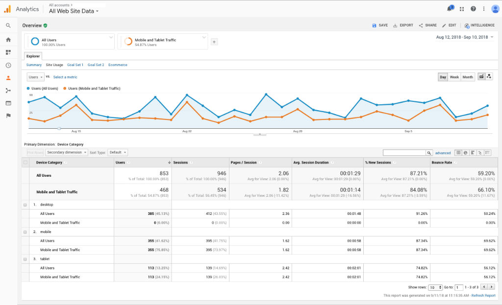
What I’ve seen in analytics data of client’s sites, is that there is a clear trend of mobile and tablet traffic starting to represent the majority of traffic to the site. In recent weeks for some of our biggest clients
This particularly seems to be the case in B2C scenarios where traffic is
If your site is primarily reaching Business customers who are accessing it at their place of work, then desktop traffic tends to represent the majority (i.e. around 70% of visitors) and I imagine this may continue to be the case in the near future. Though I wouldn’t discount the importance of ensuring your site is optimised for and working well on mobile.
To read more about How Search Works Google have a good website here.
